I was working on a script earlier today and needed to take a break from it. This is a second major rewrite of a concept, and it’s a challenge to make plot changes, to tweak the characters, and still retain an enthusiasm for the work. So, to give myself a bit of a breather, I decided to either work on something else or just read through some other work-in-progress.
What I settled on is my “how I became a writer” memoir Making Everything Count. And found something that spoke to me where I am right now. A reminder to myself to trust my story-telling instincts, or at least my artistic instincts.

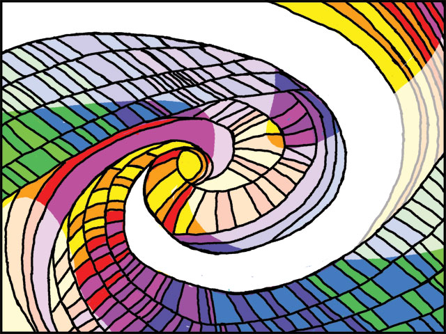
“Pastel Blasphemy #2”
What follows is a section that deals with part of my senior year of high school, and a particular project for my art class.
*****
The teacher I had for the art class my senior year was not as good as the one I had at Bellaire. Not that she was a poor teacher, just that she was not inspired. I went about the assignments pleasing myself first, and not worrying about what grade the work would get.
I had become fascinated at some point by the spectrum of color and how one color blended into the next. It became a compulsion with me to arrange things in the order of the spectrum: red, orange, yellow, green, blue, indigo, violet. I began doing pieces where the background would run the spectrum, and the figures would be solid black silhouettes against them. I even played with the colors this way in my own versions of OpArt styles. But a secondary feature of this activity was that I preferred strong, saturated colors. I liked the power and intensity of unadulterated color. I was not a pastel type girl.
Somewhere along the line, I did a class assignment in what I considered “spectrum style.” I liked the piece, and got a good grade on it. I didn’t think much beyond that, until one day, the art teacher pulled me aside.
She told me the school administration had decided to have large panels of art made to be hung in the cafeteria (actually, bolted to the walls), and the art would be by students. My “spectrum style” piece had been chosen as one of those to be done for this project – so I would have to enlarge the design for a panel that was (possibly) five feet by four feet. I was pleased with the prospects. That is, until she told me the “However” about the project: the colors of my original were too intense, and I would have to do it in pastels.
I’m not sure if this was the administration’s request or her own. Either way, I was appalled by the request. I already knew that the pastel versions of the colors did not blend into each other the same way the saturated colors did. And the blending was the whole point of playing with the spectrum in the first place – at least for me. But as with the encounter with the second grade teacher, I was not quite capable of articulating my objection to this change. I did murmur some disagreement with this requirement, but it was set aside. I believe the reason given was that the saturated, bright colors would be too strong for the cafeteria.
So, I did it. I painted that huge panel according to their request, reproducing the swirling design shapes, and coloring them in with the pale versions of the spectrum. And hating the whole thing with every stroke of the brush. By the time I finished the panel, I never wanted to see it again. I don’t recall if the panels were hung by the end of the school year. I do know that I did not want to ever look on that panel again.
As with that second grade experience, I learned something important from this experience. Where the second grade experience taught me to trust what I knew of myself, this taught me to trust what I knew of my creative work. I learned that I really did know what I was doing, in one sense. I knew exactly the effect I was going for, and that if I compromised that, the work would fail, at least according to my purposes. That pastel blasphemy was deadly bland and had nothing of the excitement that the intense, saturated version had. I hated being made to drain the blood from my own creation, and privately vowed I would never do that again.
******
I never did look at that panel again. It was close to the end of the school year when I handed it over. I don’t think I ever saw it mounted on the cafeteria wall, so I can’t even swear that it was in fact hung.
It’s a bit strange to think of so utterly disavowing something I had labored at, but that is the case. The sense of wrongness about doing it has never left me: it is not how I wanted to do the piece, and I resented being made to twist it into a pale imitation of what it should have been. The way things work on Hollywood, where a writer needs to accommodate so many (often bizarre seeming) requests for changes, there is a need for the writer to disconnect at least a little bit from the created work. But, even so, when you are still at the point of bringing the work into being, that should not be a controlling factor. What should matter most at this point is to write what most inspires my own heart.
So today, I got my pep talk from myself.
(This text was also posted on the Scribblerworks LiveJournal blog.)
“Pastel Blasphemy #2” is a piece of digital artwork to represent the experience described. It does not resemble the original artwork mentioned, other than playing with the spectrum.


Pingback: Illustrating a Memory | ScribblerWorks Graphics