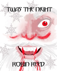
A friend wanted some cover art for an e-book novella she was working on, and she commissioned me to do the piece. Since the work in question was a comedy/horror story, this required a certain off-beat approach.
So, first the work in question —
Obviously, something’s very wrong with Santa in this story.
My first sketch was of Santa crouched behind the sleigh, fangs dripping. But I realized that the image, especially online for listings for e-books, would be too small to grasp what was up. That’s when I was hit with the idea of doing a close up of Santa.
I got about half the face sketched in, and then realized that leaving it incomplete was even creepier. Keeping to a very limited color range, and letting the white predominated worked well for the context. And of course, that glaring red eye is very ominous. The font for the title was selected for its rather “toothy” feel (it’s the Templar font).
All in all, the client was very satisfied with the result. I had fun doing it.
And you really need to check out the book itself: it’s a quick read, very twisted and funny.


