For the 2013 60th anniversary of the publication of Ray Bradbury’s Fahrenheit 451, publisher Simon & Schuster is having a cover design contest. Originally, the contest was to end November 30, but they extended the deadline to December 7. I’d bookmarked the contest when it was announced, vaguely thinking “Oh, that would be fun to do!” and then didn’t think of it again until last week.
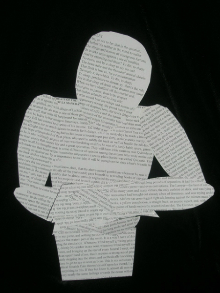
Then suddenly, the end of the month loomed, and I remembered the contest. I’d had an idea that I wanted to do, of a figure made of passages from great literature, holding a book, and on fire. So I needed to get cracking, since it would involve creating a physical object first.
As I was printing out passages to paste onto cardboard, I realized that in order for the texts to even register in the final cover art, I probably would not be able to do the full figure (intended to be stylized) that I had first thought of. So the “Man of Letters” ended up being only a partial figure.

This photo of “Man of Letters” (as I call the construct) doesn’t really give much sense of its dimensionality. It’s not really a flat piece.
For the record, the texts used were:
For the head: Hamlet’s “To be or not to be” speech; the torso: the opening of Don Quixote; the hip region: the opening of Moby Dick; the upper arms: the opening of Dante’s Inferno; the hands: Hamlet again; the forearms and the book pages: Joseph Conrad’s Heart of Darkness. If I had gone full figure, the legs would have been the opening for Dickens’ David Copperfield.
I had chosen these passages because, for me, they spoke to many of the ideas and issues in Bradbury’s story.
Once the “Man of Letters” was put together and photographed, then came working in Photoshop. I was generally happy with the final execution of my idea.

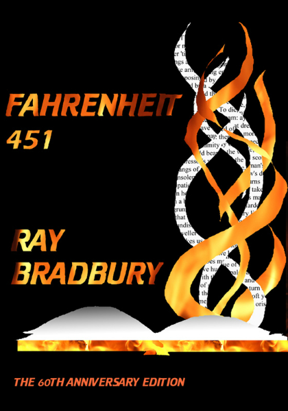
And that was enough … for about a day or so. Then the whole matter of “cover art” kept bubbling in my head. The contest specifies that the winning entry will likely not only be the cover for the first printing of the 60th anniversary edition (and one imagines any additional printings of the edition – but they’re not promising that), but also used for display art for promotional purposes.
When you start thinking of how books are displayed these days, both online and in shops, you realize the need for strong graphics that catch attention but are also very clear about what the shopper is seeing. When I looked through some of the other entries in the contest, I was really struck by that factor. Many of the entries are visually very, very interesting. Many are even very striking graphic designs that speak to the story and its meanings. But as shop displays, many of them are also too much “art” and not enough “advertising,” as it were.
Even my own design had that problem. I was being so clever in my selection of passages, but that’s not going to register as display art.
So, my over-heated brain started toying with a second design – something simpler, more direct. And, again, I ended up happy with my results.

The winner of the contest will be announced in January (the new edition of the book is to be published a couple months later). It’s strange, entering a contest like this — where everyone’s entries are on view. There are many strong entries.
But in the end, for me, it is the satisfaction of answering the challenge of the contest, to come up with a design that can serve their stated purposes and that also represents the work in question. (Plus… they’re samples of my work, for anyone looking to commission a cover artist for a book. Heh.)


