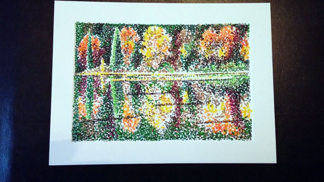
In the process of doing these art cards for my client, I keep an eye out for images I can work from or ideas I can use. When a friend posted a lovely image of autumn trees on Facebook recently, I loved the color mix, so I had to give it a try.

I had barely begun when I realized that working in such a small size and having a reflection on water in the image, all to be caught in stippling, was a challenging thing. It’s not as easy to get the type of detail with stippling when working in such a small space.
The “trick” is to just keep going and not giving up. To do this, I start with the lightest colors first, so inevitably it seems vague. It’s the reverse of when I’m working in pencil, where I define the image by beginning with the “negative” (or darker) spaces. I have to switch my thinking and mental imaging process to do the stippling in color.
However, in the end, I like how this came out.


