 So, yet again I’m posting multiple days’ worth of work.
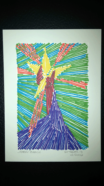
With Number 13, I wanted to see what I could do with straight lines and color. Of course, the limited number of colors I have to work with affects the result. I might have liked a darker background. And I think I made the wrong decision on how to handle the lower part of it, with the swirl of color around the arm.
@
@
@
@
@
@
@
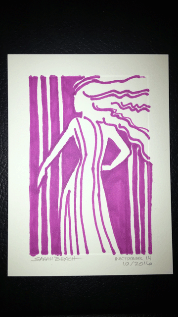 For Number 14, I opted for a monochrome approach, using solid blocks of space. I’m trying to look for different ways of looking at things. This is something bolder than I often use.
@
@
@
@
@
@
@
@
@
@
@
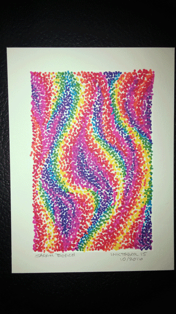 I decided to go more abstract with Number 15. I’m back to my stippling. Here I decided to play with the spectrum sequence. The basic background thought was of flame. So the yellow bands went down first. Then, still thinking “flame,” I added orange and then red. However at that point, before I moved from red into the pink to purple range, I decided to work the other edge of the yellow: green. I didn’t want to go over-board with that, since the aim was to have most of the remaining space (negative space) be the blue-purple background. So a little bit of green, then the lighter blue, and then the blue-purple filler.
I ended up pretty happy with the results.
@
@
@
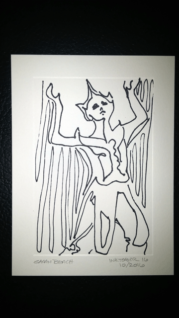 When it came time to do Number 16, I decided to do some practice in contour drawing. I haven’t done such in ages. Technically speaking, I fudged it a little, since the point is to do the whole thing without lifting the pen from the paper or crossing lines. I did restart lines in this, but for being out of practice with it, it turned out okay.
I was working from a photo of dancer Ruth St. Denis in the garb of a Siamese folk dancer.
@
@
@
@
@
@
@
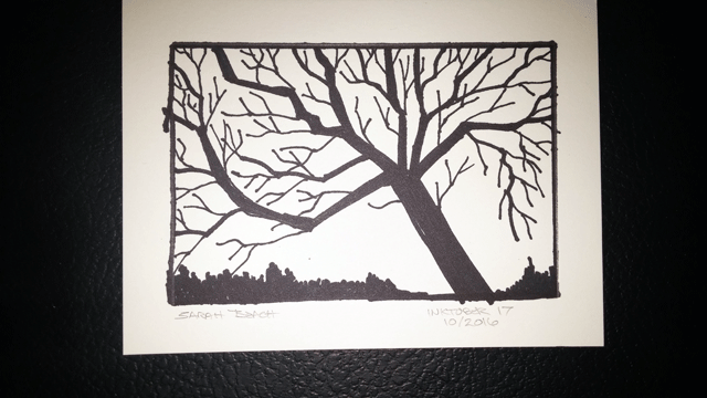
The last of this particular set, Number 17, I went for black and white and an angular rendering of a tree with bare branches. Adding the slender branches and twigs is always an ify thing in my mind, though I’m not sure why. Perhaps because they can’t quite “go anywhere”, but instead have to make some sort of sense in their placement.
