Learning to Work More with Photoshop

(Originally posted on LiveJournal)

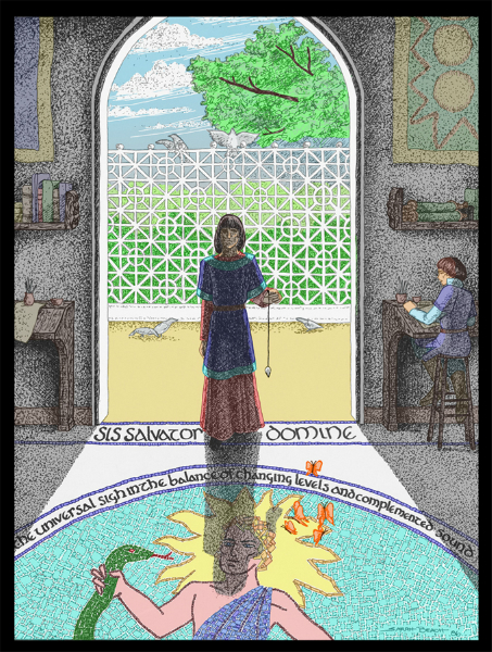
I’ve been working rather intently on the first draft of a script recently, and when I needed to take a break from it, I have worked on coloring an old pen & ink drawing in Photoshop. It’s one I did for Mythlore, based on one of Charles Williams’ poems, “Taliessin in the School of the Poets.”

It’s been interesting to start get a greater degree of comfort in using the Photoshop program. I’m still a long way from having a mastery of it, though.

In the meantime, I’ve uploaded a version of the finished colored piece — hope it interests you all!

taliessin-reduced
Comments

wellinghall – Jan. 16th, 2011

I am very impressed.

scribblerworks – Jan. 16th, 2011

Thank you!

I’d always been fond of this piece. Coloring it was an interesting experience. What amused me most was that I went and checked the text of the poem after I’d finished the coloring. I was pleased that I had the right coloring for the butterflies.

Williams is a real challenge for illustration. And doing the poems, for me, required inclusion of text in the design.

I’ve only scanned a few of the old Mythlore pieces so far. That’s going to take a while.

wellinghall – Jan. 16th, 2011

May I send it to my father in law? He is the secretary of the Charles Williams society, and I’m sure he would appreciate it.

scribblerworks – Jan. 16th, 2011

Certainly!

I’m thinking of putting it on blank notecards from Zazzle.

wellinghall – Jan. 16th, 2011

That would be a good idea.

scribblerworks – Jan. 17th, 2011

When I get everything up and running, I’ll be letting everyone know.

😀

Lots of artwork for me to play with.

sartorias – Jan. 16th, 2011

That is lovely! The tiles–wow!

scribblerworks – Jan. 16th, 2011

Thanks!

The tiles were outlined in the original, and I could have left it that way, but I sort of liked the idea of implying the white grout. Call it an obsessive reaction. 😀

(Anonymous) – Jan. 16th, 2011

Did you use the paintbrush? Techniques???

scribblerworks – Jan. 17th, 2011

I used several different methods. All in layers of course.

Some of it was selecting large sections and just filling them with a flat color. Tweaking with paintbrushes and pencils in the program of various sizes.

Putting some of the details on a different layer. Such as the latice fence in the background. Opaque white for the fence and doorway frame in a layer that went over both the floor, greenery and sky layers.

The deep shadow was done by making a dark transparent layer and then just cutting away everything that was not shadow. That added to the stippling in the original gave me the contrast I wanted between the shadows inside and the bright sunlight outside. It was then just a matter of adjusting how transparent to make that layer.

I wanted the butterflies to stand out a bit more, color-wise, though. And that brought me up against one of the realities of coloring older works in Photoshop. You make a copy layer of the original, make it as transparent as you can, and still get the impression of the ink-work. But the whites of that layer still tone down the saturation of the layers underneath. Makes me a little nuts, because I LOVE saturated colors. The answer for the butterflies was to do most of the coloring on the lower layers, and then the saturated highlighting on the final top layer. The phrase in the poem referring to them was (from memory here, so I’m not claiming it’s exact) “the golden weight on butterfly wings”. Of course, Williams was being metaphorical about poetry in using that, but for an illustration I thought “Oh, throw them in visually. Why not?”

I sort of wanted to edge the lettering, on at least the “sis salvator domine”, with a metallic gold effect … but I haven’t figured out how to do it. I expect it would involve using the chrome filter and a color tint layer over it, with a lot of cutting – but it was more work for a tiny detail effect than I was willing to do this week.

Related Images:

Posted in Illustration | Tagged , , , , , | 1 Comment

Work in Progress – Zoe Alone: Part 3

(Originally posted on LiveJournal)

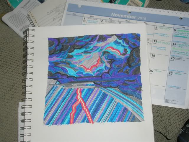
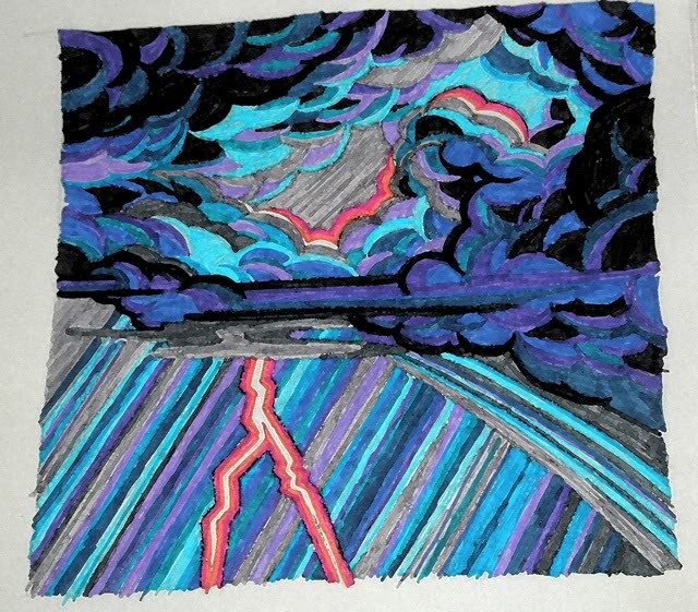
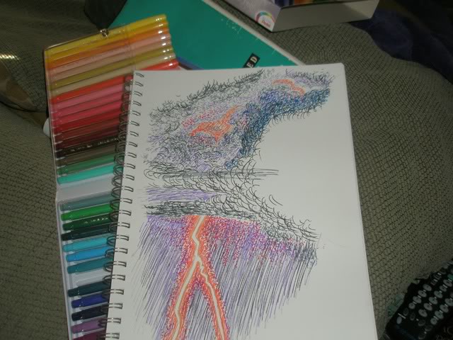
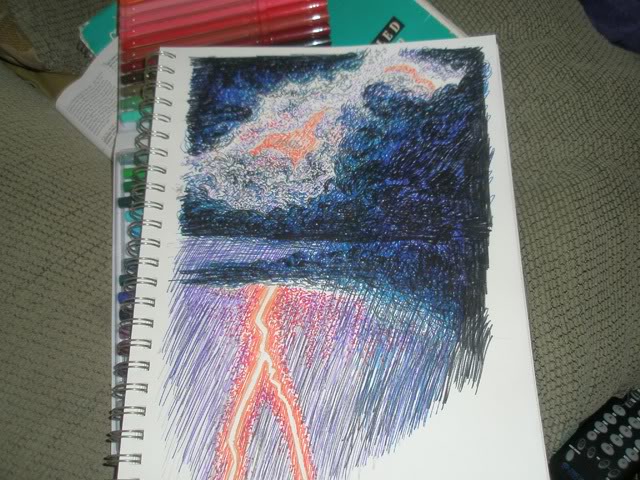
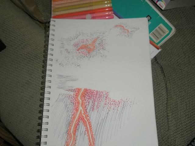
This is actually an extension of the previous post. I liked the original color sketch for itself, but it didn’t quite suit what I want for the comic story. So I did a second sketch. And this was more in line with what I’ve been thinking of for the style. (This is a photo of the sketch, not a scan, and the following Photoshop versions are messing with the photo.)

scribblerworks zoe storm sketch 5

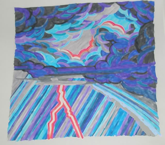
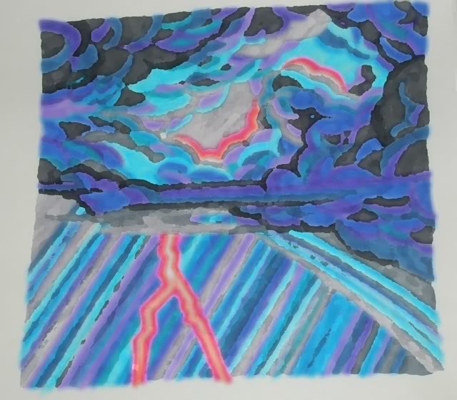
So, I decided to check out the Daub filter and see what that got me. Which was this —

scribblerworks zoe storm daub

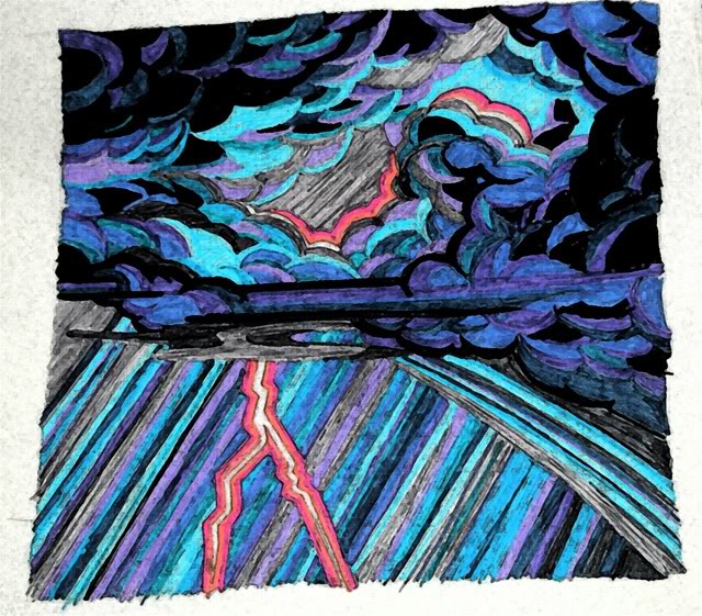
This intrigued me, but wasn’t quite what I wanted. And it makes the colors lighter than I want for the dark night scene. So I tried the Fresco filter.

scribblerworks zoe storm fresco

This I liked. Mostly. But it changed the tone on the “hot” colors around the lightning bolt. Hmmmm. So I tried the Watercolor filter.

scribblerworks zoe storm watercolor

I rather like this one, and it may be what I use in the end. But out of curiousity, I also tried the Palate Knife filter.

scribblerworks zoe storm palate knife

I sort of like the way the colors blur here. But I’m not sure it would work for all the panels. Decisions, decisions!

In the meantime there were two other filters that I tried out just for fun. I don’t intend on using them for the project.

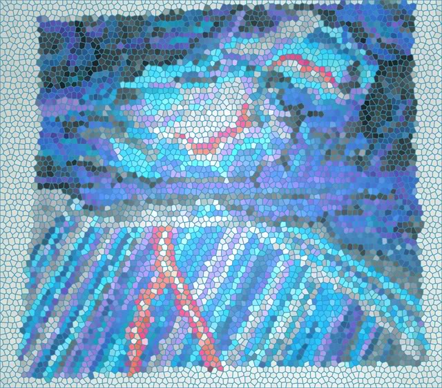
Here you have the Stained Glass filter —

scribblerworks zoe storm stained

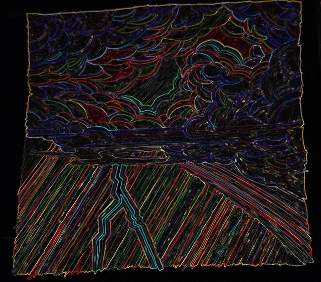
And then there’s this thing called the Glowing Edge filter. It really amuses me, and I’m going to have to find SOMETHING to use it on!

scribblerworks zoe storm glow edge

All in all I think it was a profitable day of considering things.

Comments

sartorias – Nov. 9th, 2010

I do like those clouds!

scribblerworks – Nov. 9th, 2010

I was really happy with how they turned out, and will keep this tryo sketch at hand when I start working on the actual page.

eldritchhobbit – Nov. 9th, 2010

Gorgeous!

scribblerworks – Nov. 9th, 2010

Thank you!

The possibilities in Photoshop are intriguing me.

I know people who do art totally in Photoshop, manipulting effects to build up an image. And I know people who use it with various drawing programs, and do “standard” art entirely in the programs.

But for me, I’m having fun thinking of ways of taking my “standard” hard-copy made artwork a step further for interesting effects.

The one thing about computer art, though, is that for the finished product there is no unique “original” object. This is of concern for artists, who sell originals to make a living. If it’s on the computer, there is no unique original to sell – only prints. I suppose one can sell prints to buyers (actually, I have bought such), but it’s still not the same.

Work in Progress – Zoe Alone: Part 1
Work in Progress – Zoe Alone: Part 2

Related Images:

Posted in Comics | Tagged , , , | 2 Comments

Work in Progress – Zoe Alone: Part 2

(Originally posted on LiveJournal)

“It was a dark and stormy night….”

So, I wanted to take a break from writing and doing thumbnail sketches for Zoe Alone. I figured that since I am planning to do the coloring by hand on paper, I might as well do some trial runs on the stormy sky for the first page. So this is the first run at it. I don’t know yet if this is the route I will end up going, but you don’t know if you don’t try it.

I build things from the lighter colors first. I was working from a photo reference for this, although the reference didn’t have this much orange “hot” color to it.

scribblerworks zoe storm sketch 1

Next came trying to build the lighter cloud areas, lit up by the lightning strike. Not so easy to know where to put things, though. Because you are darkening the page in order to have it lighter later. Which sounds confusing, but you’ll see….

scribblerworks zoe storm sketch 2

Then I went for the really dark stuff. After all, it’s a thunderstorm at night.

scribblerworks zoe storm sketch 3

I had originally thought that would be enough, but when I looked at it, it was still to light. So I added another bit of color.

scribblerworks zoe storm sketch 4

I’m not quite happy with this – at least not for the comic page. It’s an interesting look, but … I’m not sure. I think I may have to try some other options. It’s all so experimental. My brain starts considering other possibilities — but some of them seem too elaborate for panel art.

Still, practice is a good thing.

Comments 

sartorias – Nov. 8th, 2010

I want those pencils!

scribblerworks – Nov. 9th, 2010

Heh. They’re not actually pencils. They are Pentel Arts color pens (felt tip pens). I like them because the inks are rather saturated, compared to others. I also have a set of Faber India ink pens, but those colors are a bit more “wash” looking. I’ve used the Pentels off and on, since, oh, high school.

Work in Progress – Zoe Alone: Part 1
Work in Progress – Zoe Alone: Part 3

Related Images:

Posted in Comics | Tagged , , , | 2 Comments

Work in Progress – Zoe Alone: Part 1

(Originally posted on LiveJournal)

Recently, a handful of friends from comic circles decided to pull together an anthology book, to be published print-on-demand. Most of this group were active parts of the original Shooting Star Comics Anthology #1 – a project that was conceived in December 2001 and manifested as a book-in-hand in late July 2002. We were novices at the business side of comics at the time, and didn’t realize that just-over-six months production was exceptional in any way. Ah! the power of dreamers! Anyway, one of those bright minds decided “Why not do a sort-of anniversary anthology?”

The original anthology had 8 page stories, in black and white. This one will have 12 page stories, in color.

I had originally intended to submit a co-owned project that an artist and I had been developing. But his personal life has had a very rough year, and I decided not to push him on this. After all, there’s no sure money to be had from it, and it would be time consuming at a time when he has less available. Our co-owned project can wait.

So, I needed a new 12 page story.

Now, running parallel to this, I’ve had a growing irritation with Vampires! and Zombies! Everywhere I turn it is one or the other. I’m not sure why they are “cool”. Because I certainly would not want to be either one. And I’ve also felt that the true evils behind the mythos of the two states has been buried and/or ignored.

So these two things collided. And I came up with Zoe Alone. “What if,” I thought, “the Angel of Life was manifested in a world with zombies and vampires, and she could make the Undead un-dead? What if she doesn’t remember who and what she is?”

The idea intrigued me. But could I find an artist that would do the project for free, just for the heck of it? And then I thought “Why not do it myself?” I’ve been slowly getting back to doing more artwork again. Why not try this? I’ve done illustrations that have pleased me, I know I have a good sense of design. Why not? Of course, I haven’t tried sequential art before, but….

So, I decided to jump into the deep end feet first.

scribblerworks zoe portrait

Zoe herself

First there is Zoe herself. The Angel of Life… (All images that follow are photos from the sketch book, so the angle on the pages is a bit wonky. Also they are in pencil, and I often sktech very lightly when trying out ideas.)

A little bit of research turned up the interesting fact that there is not figure in folklore called “the Angel of Life”. Oh, sure, lots about the Angel of Death, but not one about an Angel of Life. That excited me! Oh, goody! I did have to work out the “mythology” for my story, though, and decide just what the nature of these vampires and zombies would be. It’s so tempting to spill all the beans about it here, but I won’t because then you guys wouldn’t bother to read the story when it’s done.

But I thought it would be interesting to post along the way about the work-in-progress. So I figured I’d show you the stages of work for the first four pages of the story. So what follows are photos of my initial pencil sketches, and some explanation of what’s going on and the choices I’m making in the pages.

When I sat down to do the first thumbnails, for the first page of the script, I realized that the page itself had to be dynamic in design. I’ve had artists express appreciation for my scripts, so I hadn’t really thought much deeper than usual. But when I started doing the layout according to the script, I had a shock. It was more challenging than I expected. I needed to think about the story even more deeply than I’d done before, plus I needed to make it clear for the reader. There was a big difference between the choices I’d make for an individual illustration and the choices needed for a comic book page.

scribblerworks zoe page1Page One

The top part of the page is a unified background of a stormy night sky (yes, “It was a dark and story night” !), with stepped down panel frames to highlight (1) a lightning bolt, (2) distant figure of Zoe with a lightning bolt, and (3) an old man, Ted, sneaking along a wall. There will be narrative captions, single lines setting part of the suspense. Then a vampire pounces on Ted. Originally, that was the end of the first page. But when I started working on the sketch for the second page, I realized I needed to have the vampire bite Ted – or try to bite him – here, because the composition for page 2 would work better that way.

And that was another lesson in the difference between scripting and what happens when the artist starts composing the layout. Slightly different perceptions of where the drama gets focused.

scribblerworks zoe page2Page Two

First thing I did was a preliminary sketch of the moment when Zoe interferes with the vampire biting Ted. I’d originally intended for the encounter to be seen over Zoe’s shoulder looking down at the vampire, who would have turned her head to look up at Zoe. But I couldn’t figure out how to go from that angle into the next panel when the vampire tries to attack Zoe. At least not in a fluid visual flow.

I liked this composition, Ted on the ground, the vampire over him, startled by Zoe, and Zoe herself standing there calmly. Great! I thought. Good to go.

Except this panel was going to be the upper left corner — and I suddenly realized it leads the eye off the page to the left. Oops, that’s not going to work, when I want the reader to go right. But WHEW! simple solution would be to just flip the composition. I’ll have to change some details like how Zoe’s hair is blowing to fit what will be the angle of wind and rain, but that’s easy peasy. So, I’ve got panel one for page 2.

And then I looked at my script, with it’s bland panel sequence. And my brain said, “These little blocks are NOT going to work.” Because in panel 2, the vampire leaps up to attack Zoe. “Oh, what the heck,” said I to myself, “make the panels suit the action.” And myself thought this was good.

I was so happy with the way the three panels led from one to the other. Then I looked back at the outline description, and realized I’d forgotten the bottom panel, where the now non-vampaire runs away. Yes, it was always intended to be this shape, but I’m really happy that it works.

scribblerworks zoe page3Page Three

Ted helps the drained Zoe, taking her to shelter. There, he explains why he was out in the storm. Zoe doesn’t understand what she did, but she agrees to help Ted.

Meanwhile……

scribblerworks zoe page4Page Four

The demon master of vampires feels something has happened (there’s an explanation, but it would be rather long for this post, which is long already), so he sends his minions out into the world to find out what’s going on. The unmade-vampire has taken refuge in an inn, and while she is there, the Angel of Death comes in, looking for “someone”. The unmade-vampire then goes to the demon master, begging to be made a vampire again, telling him about the Angel of Death. The demon then considers obliging the unmade-vampire (but will get a surprise on Page Five).

When I did this preliminary layout sketch I realized a couple of things. Panel one, facing the demon straight on didn’t quite work. It stalled the eye. Also the single panel in the inn didn’t quite flow, story-wise. But I suddenly realized that if I put the unmade-vampire begging before that – and she tells the demon that she saw the Angel of Death, that panel becomes a flashback that does work in the flow. Hence the arrows to switch the sequence.

scribblerworks zoe page4 panel1Then I did a separate sketch of the demon at a slightly different angle – to show that he is pained by what is happening.

So, there you have it. The beginning of this project.

These are very rough starting sketches, of course. I need to do more character conceptualizing, practice with figures.

I was unnerving myself once I’d made the choice to do the art myself. I’m really biting off a big bit doing this. But now that I’ve gotten this far on the project, I’m starting to have hopes that I may actually be able to do it!

I’ll certainly be interested in reactions and feedback, though. So, have at it.

Comments 

wild_patience – Nov. 7th, 2010

I like it. I would be willing to buy this comic.

scribblerworks – Nov. 8th, 2010

That’s always encouraging to hear!

I’m actually enjoying working on this story. For me, at least, it’s something fresh in the vampire/zombie realm. And that appeals to me.

(Deleted comment)

scribblerworks – Nov. 8th, 2010

Thank you! I’m still feeling a bit rusty on the art front. But having a “good concept” helps with the inspiration. It’s making me do the work of planning the art more diligently.

lisa_marli – Nov. 8th, 2010

I think you’ve been talking to James too much. 😉

But good for you! You are a good artist and this will help your art style.

I can’t wait to see more.

scribblerworks – Nov. 8th, 2010

“Talking to James too much”! LOL!

Well, yes. I have been studying at the James A. Owen School of Self Promotion. 🙂

But posting the progress is also a way of nudging myself along. Besides, I am interested in process in and of itself. It’s a way of testing out story concepts.

Work in Progress – Zoe Alone: Part 2
Work in Progress – Zoe Alone: Part 3

Related Images:

Posted in Comics | Tagged , , , , | 2 Comments

Unearthing My Artistic Past

(Originally published on LiveJournal)

The last few months have been a process of disinterring both my life and my apartment. I babble about some of the spiritual matters connected with this process elsewhere on the Internet (at scribblerworks.blogspot.com).  Getting back into working on The Ring of Adonel has been part of that process. Last night, I was moving some boxes of books to make way for a dresser I had just purchased from a neighbor who is moving out of the building. (I really needed the dresser!) And I had to deal with a bunch of old matte boards, unused canvas boards, a large box that is storing some old paintings of mine. And I came up with two paintings I had completely forgotten. Well, maybe I shouldn’t say completely forgotten.

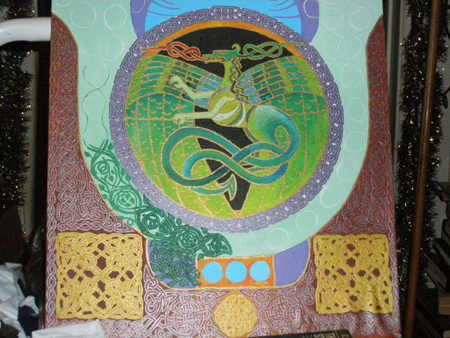
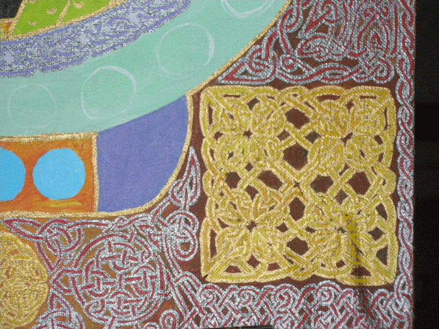
The moment I saw them, I of course remembered them. One is a rather complicated piece of a dragon, done in Celtic knotwork/interweave style — and most of the work is the border around the dragon. There’s a reason it’s incomplete — it’s complicated detail work. I looked at it, and I don’t even recall what some of the intended interlaces were meant to be. (I’d painted in the backgrounds of the various figures and borders in flat colors, and the interlace would/will go over it.) But I otherwise remember it.

scribblerworks-knotwork-dragon-1

[The above is as complete an image as I could shoot at the time of the uncompleted painting. The edges of the knotwork lines was done with metallic paints, so they were rather highly reflective of the flash.

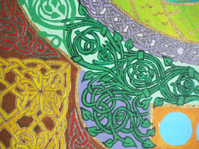
The following two images are detail shots of the painting, showing some of the finer points of the knotwork.]

scribblerworks-knotwork-dragon-2

Underneath the circle of the dragon there is a knotwork of vines, which will have bright pink flowers sprinkled in, once all the vines are painted.

scribblerworks-knotwork-dragon-3

Another detail, showing one of the knotwork squares that sit on the lower corners. The background has red knotwork on a brown background.

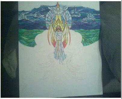
The other is a painting in a style I called “stained glass” (the design is broken up into little segments like the pieces of a stained glass window, and all outlined in black, like the lead framing in actual glasswork). It’s a religious piece, of Christ and the implications of the various elements of the world. The central figure had been completed, and a band of the background behind him. But I never got around to finishing it.

I looked at that painting and knew exactly how I intended to finish it, the colors and their gradations, how the segments would break, everything. It was complete in my head, very differently than the dragon painting was. Obviously, the “ultimate design” of the dragon painting had some flexibility, since I can look at it and know the general shape of my intention, and be certain that I can pick up from where I left off and produce a satisfying piece. But I know it will not be exactly as originally intended.

scribblerworks-unfinished-christBut the Christ painting is very set, I can see it in my head. Anyway, finding these two pieces was kind of exciting. I can finish the Christ painting. And I’m happy about that for a bunch of reasons. There’s the satisfaction of completing it, of course. But it will also let me get back into practice in working with acrylics. And that last reason is sort of important to me right now, because I’ve also begun the first steps toward doing a painting I’ve been thinking about for years.

Okay… so I’m going to tell you about it too. Way back when, I found some terrific photos of Michelle Pfeiffer, and I was struck once again of what a remarkable face she has – the shape of it all, and her blue eyes. And I conceived this idea for a series of paintings of Michelle as various mythological figures. Artemis, Pele, Medusa, Thetis….. those were the first choices. I’ve always called the intended series “Mythic Michelle”. Well, I recently started the preliminary work for the Medusa painting. But I was feeling a bit uncertain about actually doing the painting, since it’s been a long time since I’ve actually WORKED with the paint.

So, now, working on the Christ painting will give me some practice with the actual paints before I tackle the Medusa and the effects I want to achieve in that. You know…. if I didn’t actually have to work for a living, I’d still be very busy working on my various projects. Heh. I’ll never be able to whine “I have nothing to do!”

Comments

sartorias     Sep. 2nd, 2007 12:47 am (UTC)

Good creative mining done! Turn it all into gold.

wild_patience     Sep. 2nd, 2007 10:32 pm (UTC)

You know…. if I didn’t actually have to work for a living, I’d still be very busy working on my various projects. Heh. I’ll never be able to whine “I have nothing to do!” You and me both! I’m loving have a three-day weekend. I played my violin for about an hour this afternoon. There’s reading and knitting to come. And, I need to ride the exercise bike, but I’ll either watch a video or read while I do that. I like the money (of course!) and the structure from working, but, boy, would it be nice not to have to!

Related Images:
Posted in Illustration | 1 Comment