Sandman Fan Art

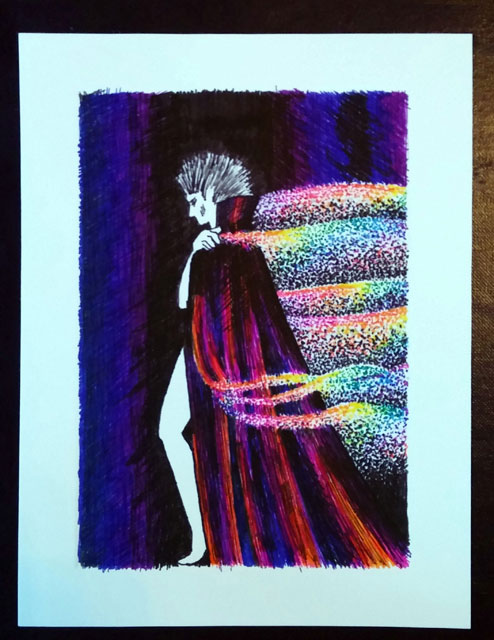
I don’t usually do fan art, but I have to admit that recently I’ve been very impressed by some ink brush sketches of Sandman characters that Colleen Doran has been doing this month. I’ve been doing several art cards (actually on commission, so I won’t be keeping the originals) lately, but suddenly, inspired by Colleen’s work, I wanted to do one of my own.

scribblerworks-art-card-dream-sandman-net

I had fun going for the effect I wanted. It was a nice break from the writing work and other art cards that I’ve been doing for my client.

Related Images:

Posted in Comics, Illustration | Tagged , , , , , | Leave a comment

Elemental Dancing

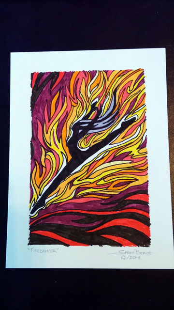
I had taken a break from some of my other work, and was doing another art card.  The idea that ran through my mind was of a dancer, silhouetted in black with flames coming off her. Trying to draw fire, like trying to draw water, is a challenge. But as it moved along, I liked how it shaped up.

scribblerworks-art-card-firedancer

As I worked on it, I thought of how the ancients considered Fire to be one of the essential elements, along with Water, Air and Earth. And I started thinking of doing other dancers for each of the elements.

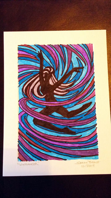
In fact, I was so caught by the idea that I began the second one immediately. However, rather than call it “Airdancer” I decided to call it “Winddancer.”

scribblerworks-art-card-winddancer

It may be a couple of days before I work on the remaining two, but I am thinking about them. “Waterdancer” will reference falling water, I think, while the last one… well, instead of earth-as-dirt, I think I will have it reference vegetation, though I’m not sure what I will call it.

Related Images:

Posted in Illustration | Tagged , | 1 Comment

Using a Photo Reference

The thing about using a photo reference is not to trace an image, it’s to have something to refer to while working on the artwork.

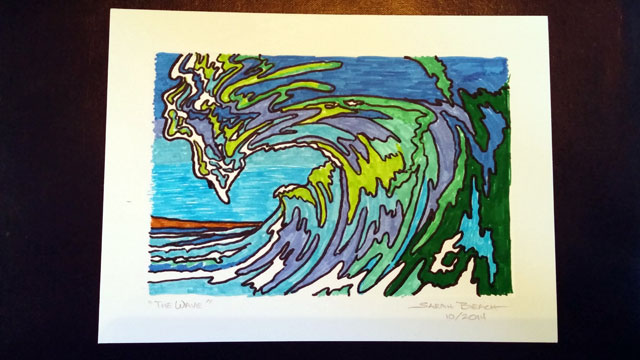
Today, during my afternoon break, I did this art card of a wave.

scribblerworks-art-card-wave

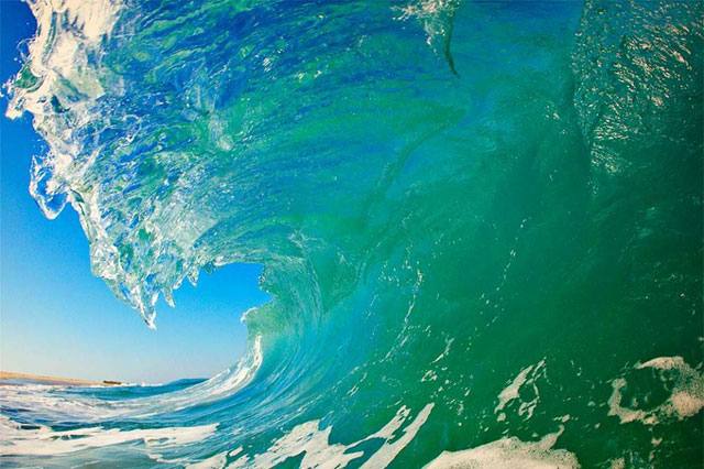
This drawing was inspired by a photo I had found of a wave. I had been wondering for a long time how to capture the coloration of the wave.

Here’s the photo:

scribblerworks-reference-wave


Drawing water is always a challenge. But I’m happy the way it worked out.

Related Images:

Posted in Illustration | Tagged , , | Leave a comment

A Stippling Challenge

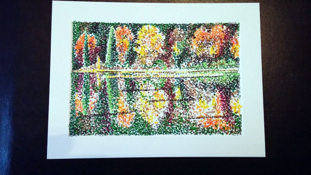
In the process of doing these art cards for my client, I keep an eye out for images I can work from or ideas I can use. When a friend posted a lovely image of autumn trees on Facebook recently, I loved the color mix, so I had to give it a try.

scribblerworks-art-card-autumn-pond

I had barely begun when I realized that working in such a small size and having a reflection on water in the image, all to be caught in stippling, was a challenging thing. It’s not as easy to get the type of detail with stippling when working in such a small space.

The “trick” is to just keep going and not giving up. To do this, I start with the lightest colors first, so inevitably it seems vague. It’s the reverse of when I’m working in pencil, where I define the image by beginning with the “negative” (or darker) spaces. I have to switch my thinking and mental imaging process to do the stippling in color.

However, in the end, I like how this came out.

Related Images:

Posted in Illustration | Tagged , , | Leave a comment

A Divine Lion

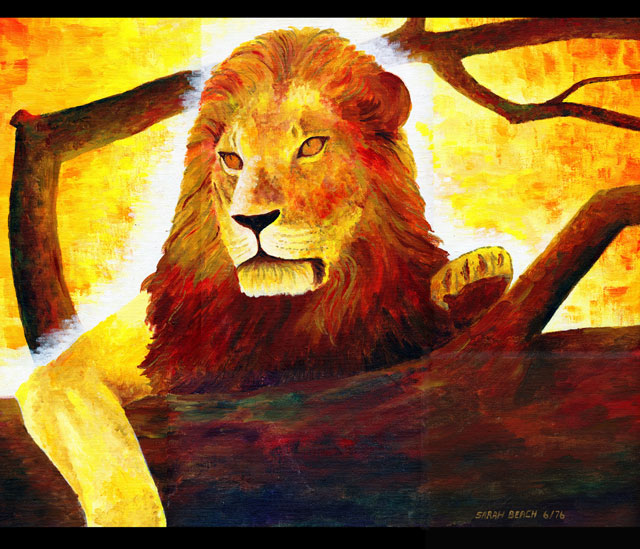
I did this painting years ago. I generally call it “Divine Lion.”

scribblerworks-Aslan-acrylic-painting

I worked in acrylics, including some florescent orange and reds. I still love the glowing quality it has.

Related Images:

Posted in Illustration, Paintings | Tagged , , , | Leave a comment

Starting to Draw Some Art Cards

I don’t know how far this will go, since it is in the very beginning stages. But I was approached about doing some small pieces of art for a client that he could then give away to his customers. That made for a challenge for me.

What sort of art? I hadn’t done regular art consistently for a while, so finding a method that suited me would take a few steps. There there was the matter of what to do them on. Art paper can be expensive. I settled on getting some card stock at Kelly Paper, cards designed for announcements. This gave me a good surface to work with, and because this particular card stock has a pressed border, it’s very handy with a pre-determined frame.
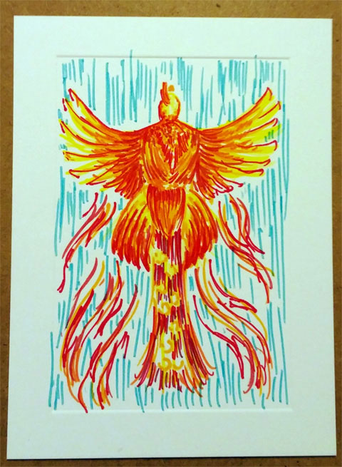
scribblerworks-card-firebird

So I experimented.

I’d been wanting to try and draw a firebird for some time, using a peacock in flight as the model. So I figured, why not try it now. It came out okay. Not ideal, but since I was getting a feel for working with the colored pens again, satisfying enough.

I went on to experiment with a second picture, that I called “Red Eye.” It was more intended to give me an idea of how well the differences in some red pens showed on the card stock (not as well as I would have liked). I played with the idea of people taking a late flight, so the eye cries planes instead of tear-drops.

Then I hunted down an image reference of a spot in Malibu, and did a miniature landscape of it, using stippling. This piece turned out more more along the lines of what I’d be happy to have out in the world. I’m much more used to doing stippling in black and white, so the possibilities of doing it in color shall be intriguing.
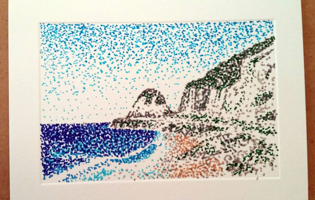
scribblerworks-card-malibu

As I said, I’m not sure what will come of this, but it’s an interesting opportunity. I’ve been wanting to do some artwork a bit more often lately, and this is certainly an option.

I’ll be taking photos of the pieces as I finish them, just to have a record of what I’ve worked on.

Related Images:
Posted in Illustration | Tagged , , | Leave a comment

On the First Day of Christmas

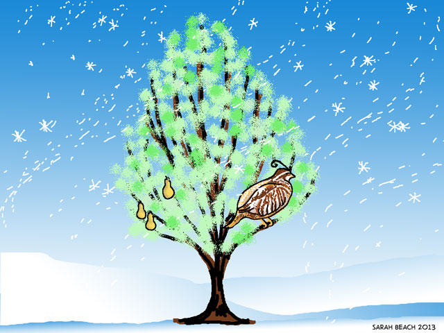
Since I didn’t do a Christmas card this year, I was missing doing some Christmas related artwork. So this morning I decided to have a little bit of digital fun to celebrate the season. I’m going to give it a try.

On the first day of Christmas, my true love gave to me a partridge in a pear tree…

12-days-one-net

Related Images:

Posted in Illustration | Tagged , | Leave a comment

Cover for a Devotional Project

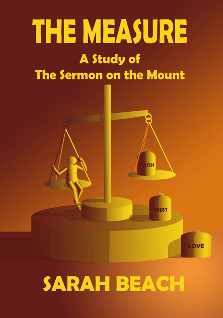
I worked my way through the Sermon on the Mount last year, and have been meaning to prepare it for (at the very least) a Kindle version. but I needed a cover design.

I went stylized this time. I’m not sure why, just a whim I had. Suiting an image to the book was the question. But I like this well enough.

The Measure

Related Images:

Posted in Illustration | Tagged , , | Leave a comment

The Professor Tells Stories

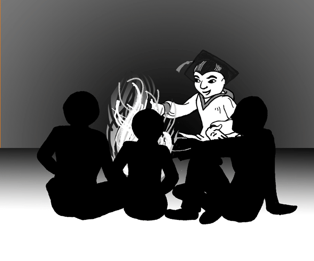
I needed an illustration for my book on creating graphic novels (formerly known as Paper Movies), about storytelling and our original impulses in that activity. So the following rather simplistic illustration resulted.

I have to admit that I am getting much amusement out of playing with layers in Photoshop. The more I use it, the more things I can imagine doing with it. It’s not actually replacing any of the other media I like to work it. Rather it’s becoming a new one of its own.

And I’m also being amused by the added things I’m having the Professor do in the book.

Related Images:

Posted in Cartoons | Tagged , , , | Leave a comment