ViaDuck and the Gallery test

I’m testing how the new Gallery Management plug-in works. Because I’m an utter newb with it.

Related Images:

Posted in Cartoons | Tagged | Leave a comment

An Archer-Artist Strikes Back

If you enjoy Archery, particularly if you shoot, and you enjoy comic books (or other popular entertainment), it can be very frustrating to see some depictions of “archers.” When a comics fan who is an archer complains that the poses the artists give characters like Green Arrow (from DC Comics) or Hawkeye (from Marvel) are not only awkward but impossible, they are dismissed with comments like “Oh, it doesn’t matter!” or “Oh, but isn’t that a great pose?” or “It’s just comics!”

A friend of mine, Jim MacQuarrie, did a blog review of depictions of archery in this year’s films back in the spring, commenting on the quality of the archery skills demonstrated in publicity stills and clips. He gave high marks to The Hunger Games and to Brave for their presentation of archery. He gave some more pointed critiques of the style shown in by Hawkeye in the film The Avengers . And he got lambasted for being a nit-picky spoil-sport.

We sighed and went on.

And then a couple of weeks ago, a noted comics inker posted a picture he’d inked over another artist’s pencils of Hawkeye. And I was in pain. You have to understand: I like both these artists in the ordinary course of events. They are good artists. The inking on this piece was lovely work.

But the pose was terrible. It was impossible. And when I mentioned this in the discussion (on Facebook), my friend the inker said (a bit defensively) that artists have told him that “archery is hard to draw.”

Like no other sport is hard to draw?

It just nagged at me, until I had to sit down. The following cartoon is the result. If comic book artists treated other sports the way they treat archery…. But hey! Aren’t the poses good?

Related Images:

Posted in Cartoons, Comics | Tagged , , , | Leave a comment

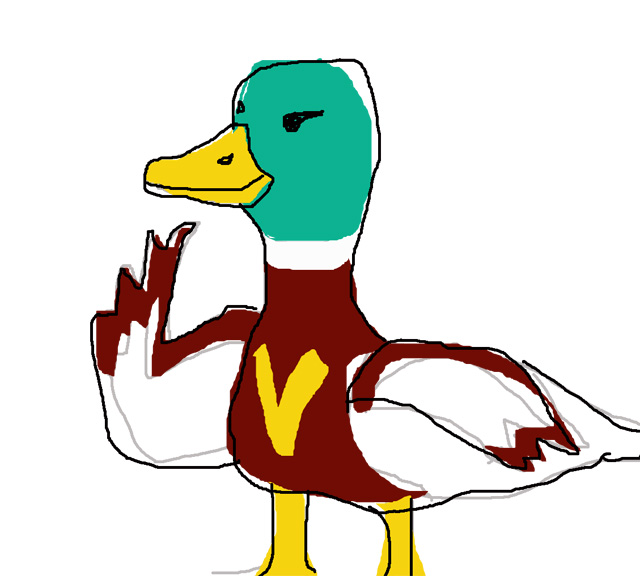
Meet ViaDuck

I had posted this on my Facebook page, but he needed to be uploaded here. Especially since I’m planning to do occasional cartoons with him.

Meet ViaDuck – the worlds fastest duck super-hero!

This is a very, very rough first sketch of the silly fellow. But it was done on a whim – that’s my only excuse.

He was conceived one day as I was driving home from Pasadena. The route includes going under a structure that is labeled as a “viaduct”. Because I have to play with my words, it of course led to the “duct” to “duck” linkage that everyone is familiar with. And because I was thinking comics and superheroes at that moment, I wondered what sort of superhero you could get with a duck. “AquaDuck” seemed to go nowhere, besides being redundant. But I decided to stick with ViaDuck — after all, “via” in Latin means “way”, and surely if one gave a duck super-speed, he’d be making his way to a lot of places.

Upon reaching home, I fired up the computer, opened Photoshop and did a quick sketch on the touch pad. I decided it would be more fun to use a mallard duck than the domestic white duck. When it comes to cartoons, we already had a white duck (Donald) and a black one (Daffy). So why not a teal-headed, brown-breasted mallard? And here he is.

I have no idea what he’s going to do.

Related Images:

Posted in Cartoons | Tagged , , | Leave a comment

Process of Art (2) for “Zoe Alone”

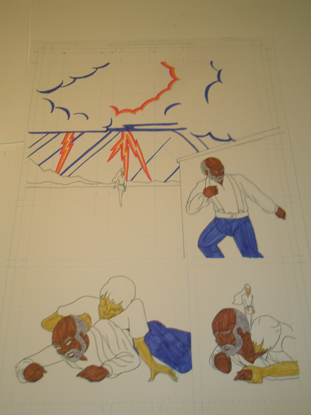
This whole graphic short story is a big experiment for me, so I figured I might as well do it to please myself. Thus, I am doing things no sane person would do on a regular comic. Like doing hand coloring on the original art. But that’s what I’m doing here.


Once the basic hand coloring is done, I’ll do another inking pass. And then I will scan the page, and continue working on the images in Photoshop. This is all to please myself, after all. The coloration for the vampire is indicative of her state.

Related Images:

Posted in Comics | Tagged , , | Leave a comment

Process of Art for “Zoe Alone”

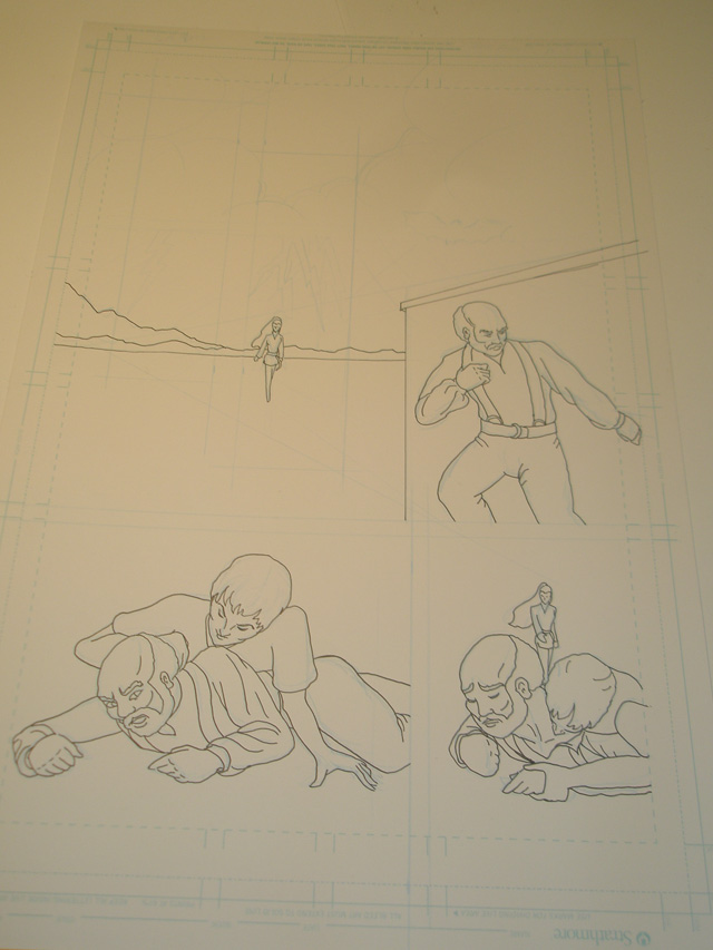
I’ve had this graphic short story bubbling away in my brain for a couple of years now. The thumbnail sketches and character designs for the story have existed for quite a while. But I’m only now buckling down to tackle actually working on the pages.

I’m stepping out of my comfort zone with this project. I’ve done a lot of illustration in the past, but not sequential storytelling.

I’ll be posting photographs (and later scans of the actual page as I work on additional matters in Photoshop) of the progress of page one. And when the story’s done, I’ll post the whole here.


The gentleman is Ted, and he’s out in a storm, where he gets attacked by a vampire. That’s Zoe coming up on the two from the background.

Related Images:

Posted in Comics | Tagged , , | Leave a comment

Sakai Usagi

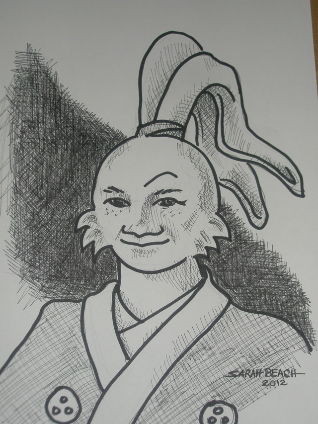
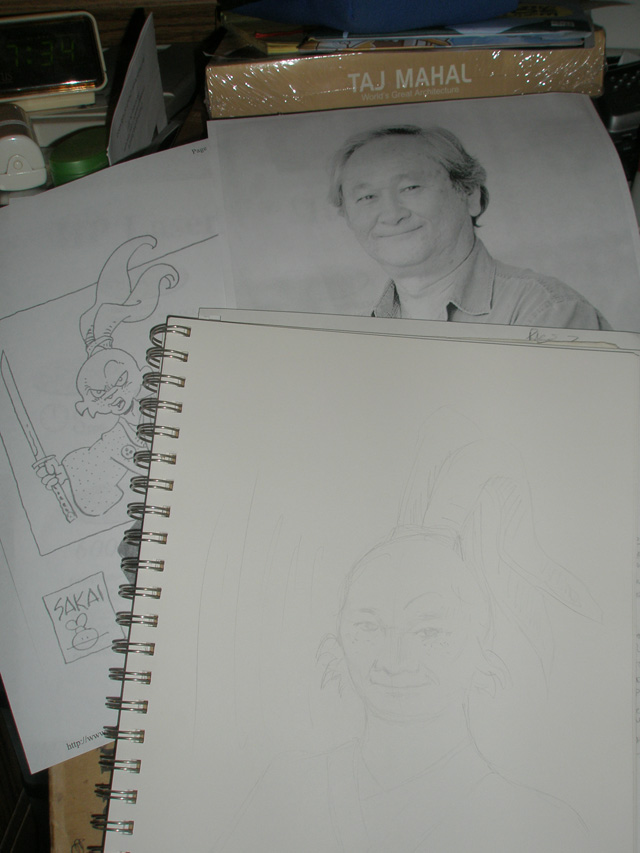
So, this is a photo of the finished piece of Stan Sakai as his ronin rabbit Usagi Yojimbo. It was rather fun to do.

Once I started doing the light shading, I realize the more realistic approach just wasn’t going to do the trick. That’s when I broke out the heavy Sharpie and just went for the bold lines.

Doing a cartoon of someone real is a new thing for me. I don’t really have much practice at it. But this was an amusing exercise.

Related Images:

Posted in Cartoons | Tagged , | Leave a comment

Sketch and references

I’d gotten the idea at the June CAPS meeting, for no particular reason other than really liking Stan Sakai and enjoying his Usagi Yojimbo very much. I just started wondering if I could do a portrait of Stan as Usagi.

It seemed worth a try. So I made a beginning.

As always, I begin with very, very light sketching, to get the general idea down.

It didn’t take me long to realize that trying to do it “realistically” would really look odd. It was a sort of lesson in why cartooning works the way it does – which is a very cool lesson, and makes me respect cartoonists even more.

Related Images:

Posted in Cartoons | Tagged , , , | Leave a comment

Lake Louise

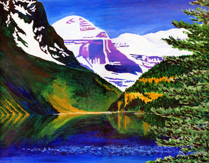
I painted this as a gift to my parents. After my mother died, I brought it back home with me.

When I was growing up and we’d travel across country to visit my grandparents in Calgary, we would take a day-jaunt up into Banff National Park, including driving to Lake Louise. Even though we went there only a few times, it was to me the most beautiful place I’d ever seen.

The painting was done in acrylic, on 18″ by 14″ canvasboard. This image was scanned in sections and assembled in Photoshop, so it has been adjusted at points for visual consistency. But other than a few minor tweaks, it’s a pretty good reproduction, particularly of the colors I used.

Related Images:

Posted in Paintings | Tagged , | Leave a comment

Drinking Light – color

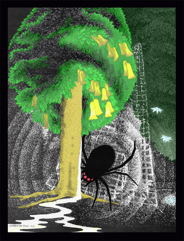
Once I colored “Drinking Light”, I found that I liked it much, much better.

I chose to keep a lot of it untinted, because the whole intent of the moment in the story was how Ungoliant was consuming and destroying the wonderful light of the Two Trees. Thus, having the color disappearing as well felt very right. I also hit on the idea of the color getting duller as the sap of the tree was drained. So at the extremes there was still some color, and a couple of flowers of the second tree remained bright (but probably wouldn’t last). I had almost colored the “bleeding sap” a gold color, but when I came to it, and looked at the picture as it stood (it was going to be the last thing I did), I realized that it was much more striking as a purer whiteness in the greys and dulled colors. So I left it alone.

All in all, I’ve come to like the colored version of the picture far more than the original black and white.

Related Images:

Posted in Illustration | Tagged , , , | Leave a comment

Drinking Light – original

I had previously posted this on LiveJournal. I am in the process of reposting material on my own site (independantly hosted database). But since I am planning on posting more of my artwork for Mythlore, now that I have finally scanned it all, I thought I would start with pieces that were already completed.

“Ungoliant Drinking the Light of the Two Trees” (from J.R.R. Tolkien’s The Silmarillion) was done when I had put in about 10 years of service as Art Editor for Mythlore. That duty had frequently included doing head pieces for specific papers, and many full page illustrations, because “we needed some.” By the time I came to this one, I was getting a bit burnt out on the duties, which led me to make more stylized choices for the drawing.

I had previously done two illustrations which had featured the Two Trees, so I had already made decisions on what they looked like, particularly the flowers. I certainly drew from Tolkien’s own description of them. But because I had previously done them, the preliminary sketches focused less on the flowers of the trees and more on figuring out what to do with the giant spider.
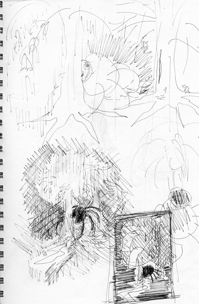
 

Looking at the sketch now, what interests me is that compositionally, I had originally intended the arc of still lit flowers to sweep leftward, away from Ungoliant. But when it came time to do the actual drawing, the “arc of light” moved inward on the page, toward the center.
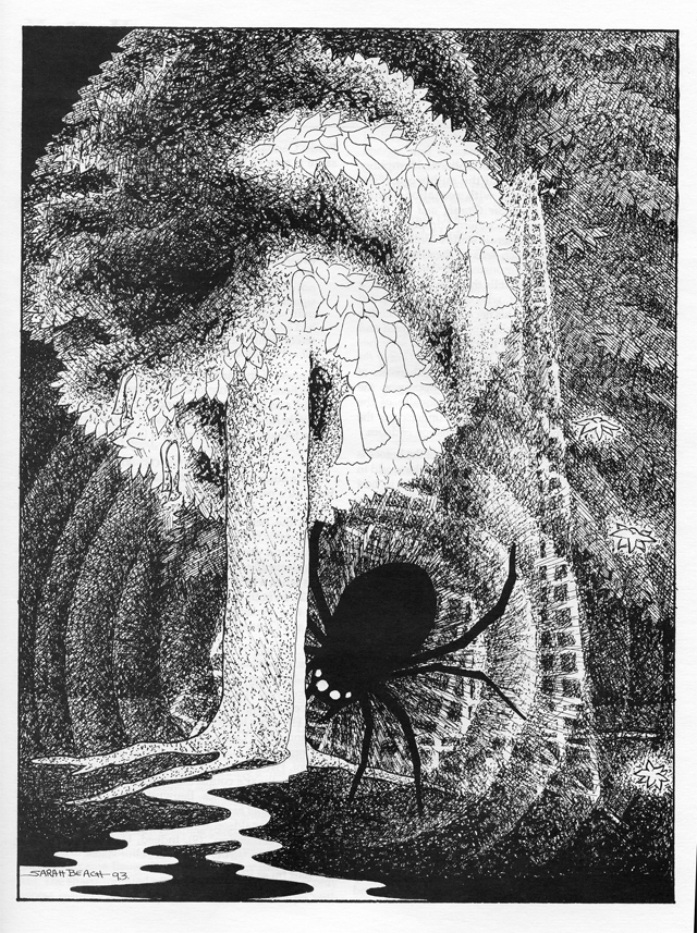
I had previously done a drawing of Glorfindel fighting the Balrog (from the Fall of Gondolin in The Silmarillion)  and had gotten intrigued by the concept of trying to render “radiating darkness”. Here I chose to try it as ripples moving out from Ungoliant.

All in all, I was fairly satisfied with the picture. I didn’t think it was a great effort, and the web looks rather mathematical. But it was okay.

Recently, after scanning the picture, I experimented with some computer coloring of the image. You’ll see the results in the next post.

Related Images:

Posted in Illustration | Tagged , , , , | Leave a comment