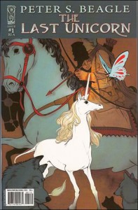
THE LAST UNICORN #1 (IDW)
Writer: Peter Beagle; Adapter: Peter B. Gillis; Art: Renae DeLiz; Inker/Colorist: Ray Dillon; Letterer: Robbie Robbins; Editor: Mariah Huehner
 From novel to animation feature to comic book, Beagle’s famous story retains its original charm. The delicate wistfulness manages to touch some vulnerable part in the audience, bringing a sweetness.
Gillis does an excellent job of adapting the story to the comic book format. The first issue does not rush, and yet moves forward at a satisfying place. He wisely sets in the key points of the Unicorn learning that her kindred are missing and the world no longer looks for or expects to see her as she is. That melancholy loss leads nicely to the issue’s cliffhanger, where sinister, shadowed figures discover the sleeping creature.
The look for the book is somewhat based on that of the animated feature. But it is not slavish, instead it has a grace of its own. DeLiz perfectly captures the wistfulness and melancholy that permeates the story. Dillon’s coloring shows an excellent touch for the story. The colors are lush, and the all-important handling of the Unicorn is perfect: she glows on the page.
I’ll look forward to seeing the rest of this adaptation.
THE LAST UNICORN #2 (IDW)
Writer: Peter S. Beagle; Adapter: Peter B. Gillis; Art: Renae De Liz; Colored & Inked: Ray Dillon; Lettered: Robbie Robbins, Edited: Mariah Huehner
I need to again compliment Gillis on his handling of the chore of adapting Beagle’s delicate classic. From Schmendrick’s regret that he is not better as a magician to the serious danger lurking in the caged harpy, Gillis makes excellent choices in the adaptation.
He is well partnered with De Liz, for the artwork continues to hold onto the charm of the prose original. But both working together achieve the special poignancy of the single page where magician and unicorn walk away from the rampage of the released harpy. In the vast dark landscape, the small figures of magician and unicorn walk toward the rising sun, while in the sky above them are hints of the cosmic web the enchanted spider thought she was weaving — with a final caption referencing “the tiny, dry sound of a spider weeping.”
That line alone, highlighted on the beautiful art is worth the cover price of the issue. It justifies adapting the tale into this format. In prose, it is a charming line in a book full of enchanting prose. In a film, there’s little way to convey it. But in the graphic form, we have conveyed all on one page the loneliness of the questers, the calm needed to face immortals, the awareness of the harsh vengeance of the harpy, and the force of shattered illusions in the sound of a weeping spider.
This adaptation is proving its worth with every page.
